Contents Show
The Products screen is used to manage the products stocked by the current rebate supplier that qualify for rebates. It allows the user to define new products for this supplier and view or modify information on an existing product. It is a tabbed page on the Rebate Supplier screen.
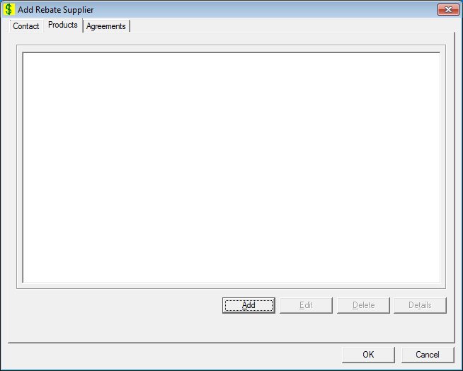
Add Products screen
Edit Products screen
Products screen
|
|
Interface InitializationUpon initial display of the screen, the following occurs:
In Add mode:
If records are listed in the data grid:
If records are not listed in the data grid:
In Edit mode:
If records are listed in the data grid:
If records are not listed in the data grid:
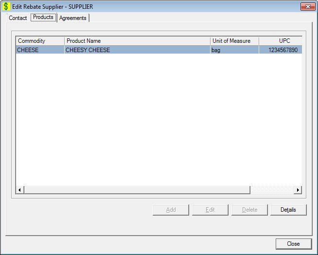
In Details mode:
If records are listed in the data grid:
If records are not listed in the data grid:
|
Unless otherwise stated below, all controls on the Products screen are visible and enabled when:
The screen is displayed in Add mode.
The screen is displayed in Edit mode.
Unless otherwise stated below, all controls on the Products screen are visible and disabled when:
The screen is displayed in Details mode.
If one or more special conditions exist that affect a control on the Products screen, the condition(s) are documented for that specific control below.
View the information in the Products data grid.
Click a product in this data grid to perform additional functions.
This is a single select read-only data grid. The control can be updated when the screen is active in Add or Edit mode (where applicable). The columns are sizable. Both scroll bars are visible.
The information on the data grid is initially presented in ascending order by commodity and product name. There is no option for resorting. The data grid will be refreshed after add, change, and delete operations.
The data grid consists of the following control(s):
Commodity column
This column displays the name of the commodity for each record displayed within the data grid.
The title of the column is set to "Commodity". The information displayed within the column is read-only.
Product Name column
This column displays the name of the product for each record displayed within the data grid.
The title of the column is set to "Product Name". The information displayed within the column is read-only.
Unit of Measure column
This column displays the unit of measure code or type for each record displayed within the data grid.
The title of the column is set to "Unit of Measure". The information displayed within the column is read-only.
UPC column
This column displays the Universal Product Code (UPC) for each record displayed within the data grid.
The title of the column is set to "UPC". The information displayed within the column is read-only.
Product ID column
This column displays the unique product identification number for each record displayed within the data grid.
The title of the column is set to "Product ID". The information displayed within the column is read-only.
It has a mnemonic of "A".
The Product screen displays in Add mode when the button is clicked.
The control is enabled when:
A record is selected in the data grid.
It has a mnemonic of "E".
The Product screen displays in Edit mode when the button is clicked.
The control is enabled when:
A record is selected in the data grid.
It has a mnemonic of "D".
When the button is clicked, a standard confirmation message (C0004) displays. The options of Yes and No are available. When Yes is clicked, the system deletes the record from the database. The contents on the Products screen are refreshed. When No is clicked, the system returns to the Products screen (the current screen) without deleting the selected record.
If the selected record is associated with at least one other record in the system or is in use, the system displays a standard error message (E0007). Click the OK button to return to the Products screen (the current screen).
Click the Details button to view the details of the record currently selected in the data grid.
The control is enabled when:
A record is selected in the data grid.
It has a mnemonic of "T".
The Product screen displays in Details mode when the button is clicked.
If data can be validated and saved on the screen, the following processes occur when the screen is processed:
A process to check for required controls as identified in the Data Map below is performed.
A process to check for valid entries as identified individually for each applicable control in Screen Elements above is performed.
A process to check for edits and cross edits as identified for each applicable control in Screen Elements above is performed.
If any checks or processes fail, a standard error message displays.
If no data can be validated and saved on the screen:
No cross edits are performed.
All values are considered legitimate.
No data is written to the database.
The Data Map defines the values saved for all controls on the screen. If available, any additional notes or comments are displayed in the Notes column.
|
Control Label |
Required |
Table |
Column |
Notes |
|
Products |
X |
· |
· |
· |
|
Software Version: 2.40.00
